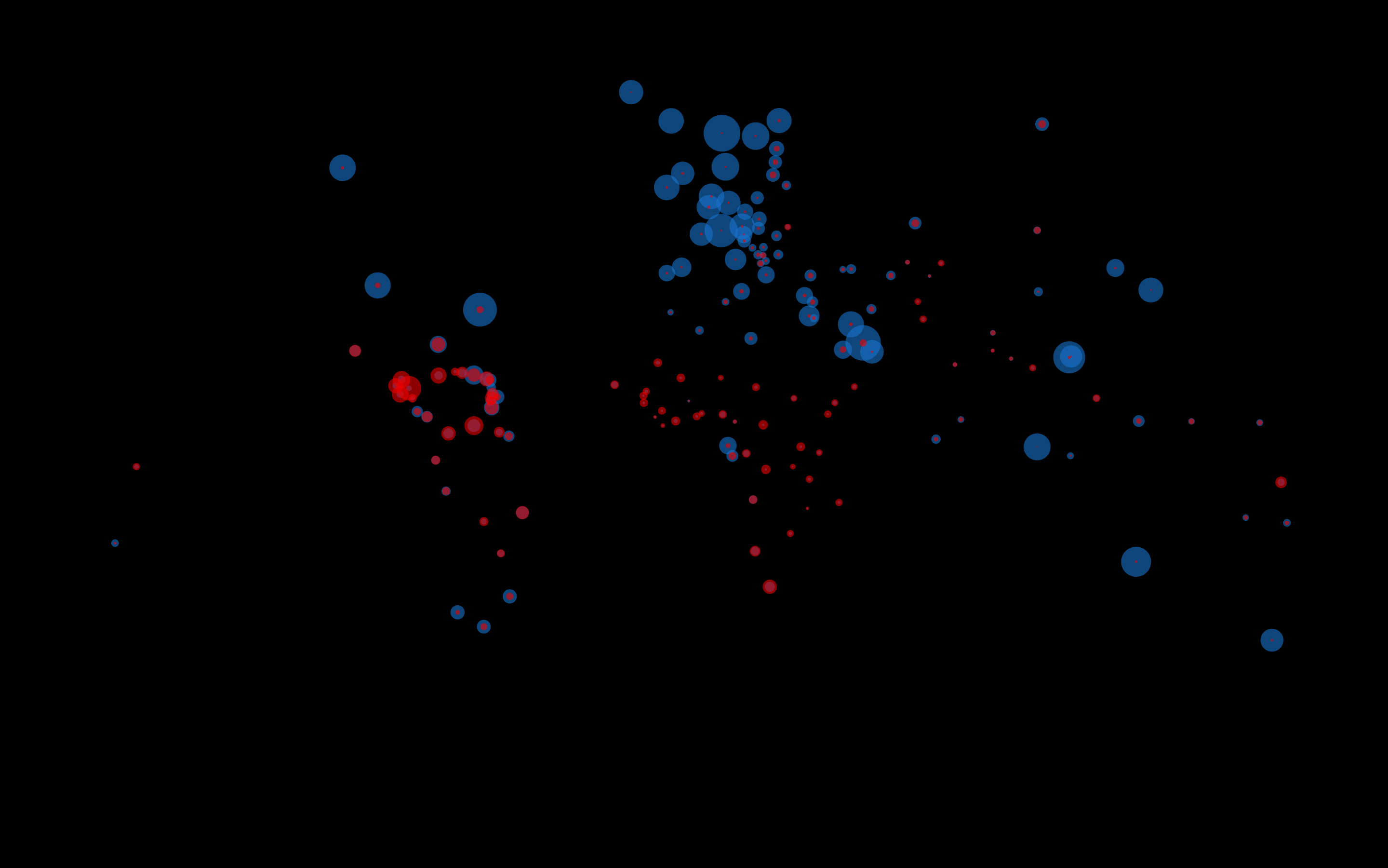
Every country is different, some are poor and some are rich but people get killed
everywhere to give you a overview how rich and criminal some countries are i created
a interactive graphic. I collected real geo data and real killing/domestic product statistics,
converted them into json files and visualized them on a world map, every circle area written
by java script code stands in relation to the real data gathered beforehand.
To give even better insides you can change the graphic and see the riches and dangerous places in the world. Give it a try...

